BasedLearn
An educational platform for technical learners - designed to compete with Udemy, Coursera, and Pluralsight on the one dimension they consistently underdeliver: UX.
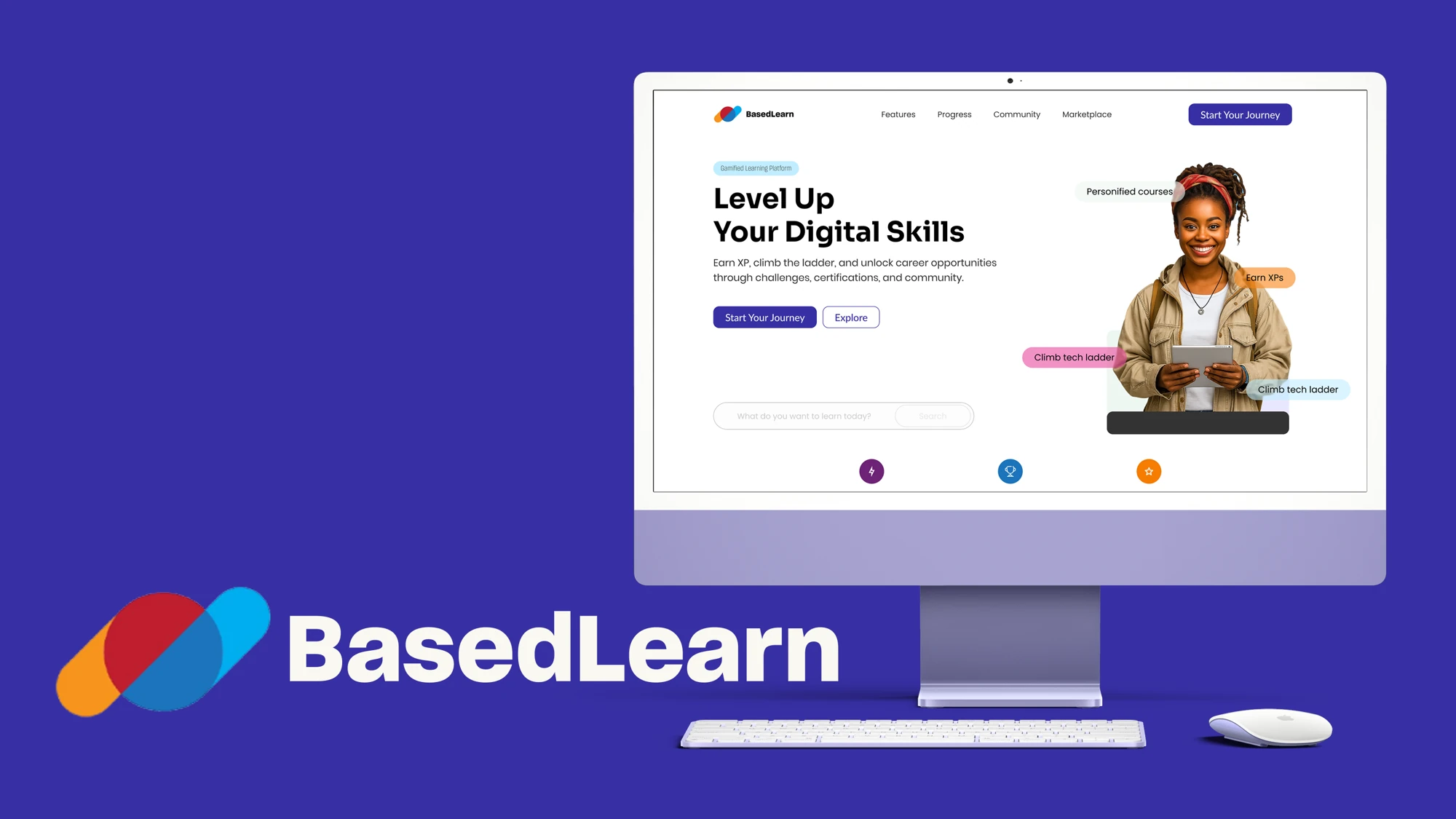
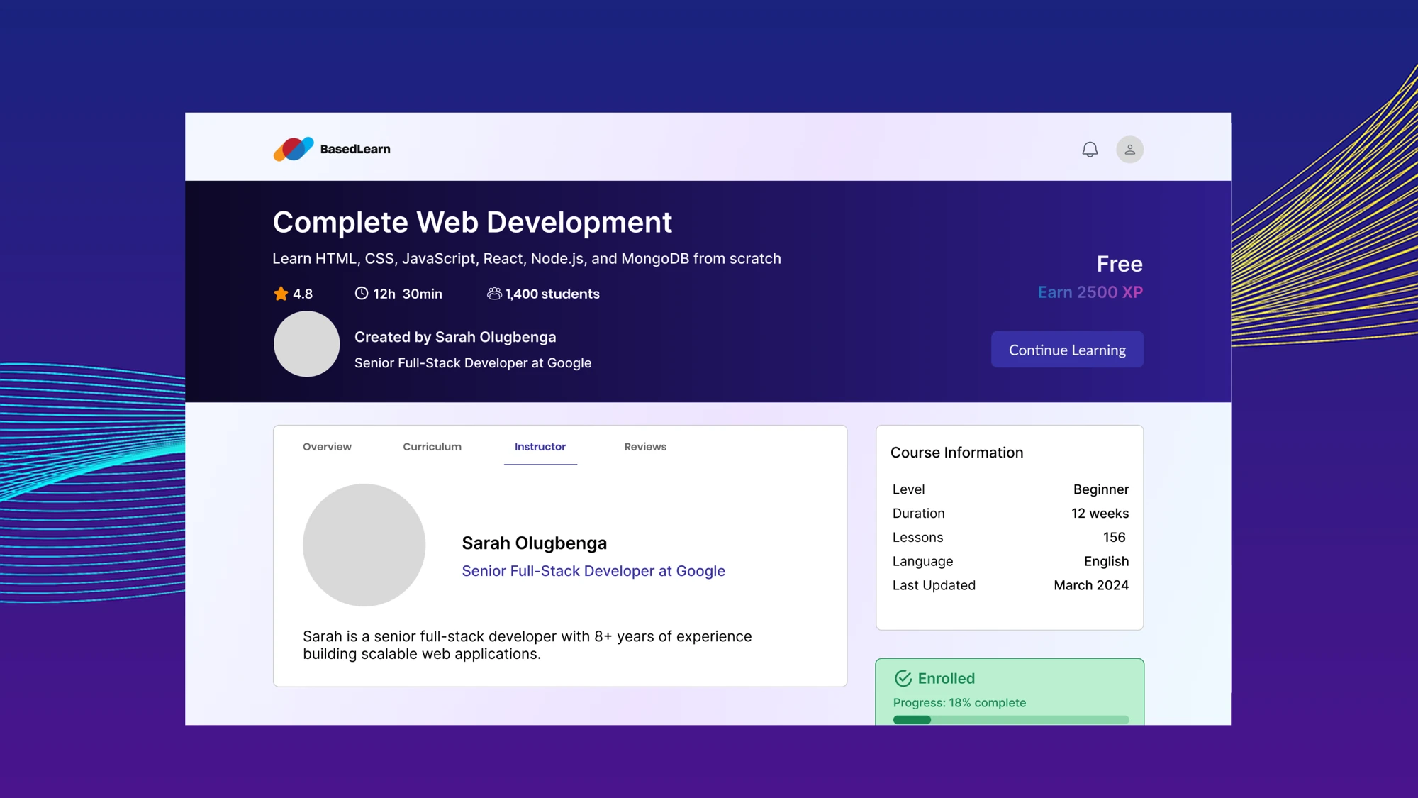
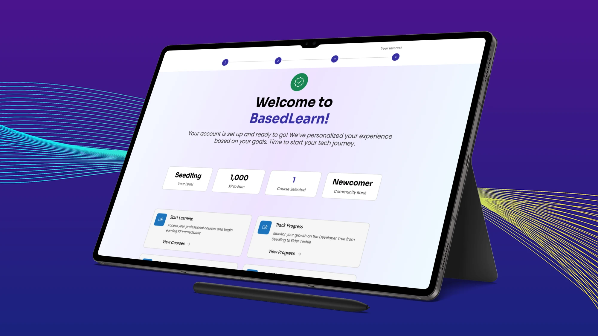
An educational platform for technical learners - designed to compete with Udemy, Coursera, and Pluralsight on the one dimension they consistently underdeliver: UX.
The Problem
The strategy and rough userflow already existed when I joined - the gap was making it visual. Technical learners are discerning users. They've used Udemy, Coursera, Pluralsight. They know when something feels cheap, half-finished, or hard to trust. The job wasn't to invent the product; it was to translate a solid foundation into an interface that technical people would actually trust enough to pay for - in a category where UX is the real differentiator.
Signature Visual
Track - the progress dashboard - was the deepest design focus.
Technical learners don't just want to watch videos - they want to know how far they've come and how far they have to go. The progress dashboard was the most complex screen in the project: surfacing course completion, streak data, skill milestones, and upcoming deadlines in a way that motivates without overwhelming. Getting the information hierarchy right took the most iteration.
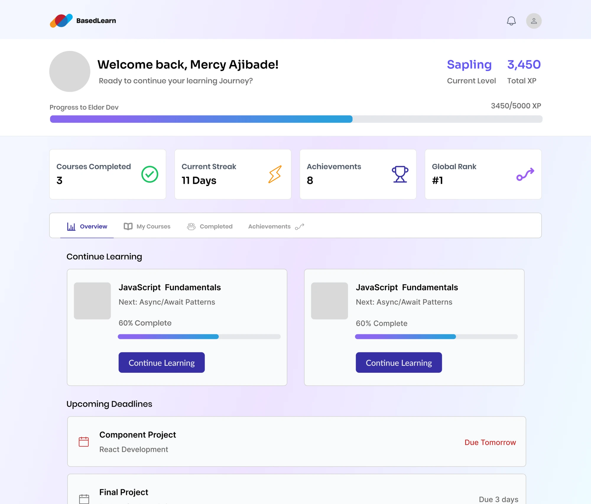
The learner progress dashboard - primary design focus for the platform.